A design to improve the experiences of Sydney Commuters
As a UX researcher and UI designer on a small team, I was presented with the challenge of improving the commuting experience for Sydney commuters. We recognized that this was a diverse group with many different needs, so we chose to focus on a specific subset: women between the ages of 20 and 30.
Through extensive research and collaboration, we were able to identify key pain points and design a product that truly addressed the unique needs of this demographic. Our efforts resulted in a significantly positive response from these commuters, and our team was proud to have made an appropriate and meaningful design.
Problem
The interviewing of Stakeholders, and some secondary research revealed that safety is a common concern among our demographic. It was then our aim to design a product that could both provide improved safety options for women on their commute, as well as ease stresses and concerns that the dangerous nature of their commute may cause.
Solution
To address the safety concerns and negative commuting experience faced by women between the ages of 20 and 30 in Sydney, we designed a mobile app called "Safe Commuter." This app offers a range of features designed to ensure safety and reduce stress for users.
The most notable features include the ability to plan trips based on safety reviews and to contact a trained safety agent in times of serious or immediate concern. By providing these resources, we aimed to improve the overall commuting experience for this demographic.
Tools
- Miro
- Figma
My Role
- UI Designer
- UX Researcher
- User Tester
Timeline
- Overall: 10 weeks
- Discovery and Research: 4+ weeks
- Design & Testing: 6 weeks
Empathise and Define
Interviews
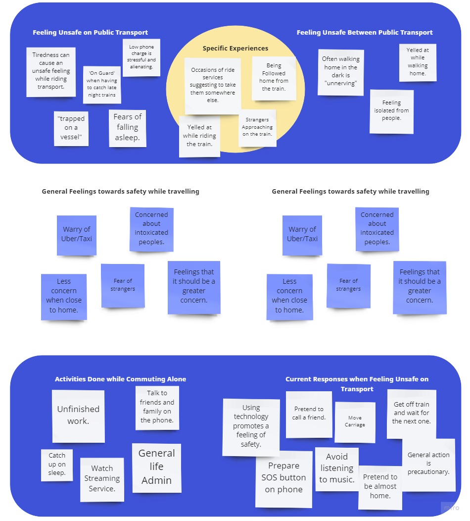
In this project, my team and I conducted multiple Semi-Structured Interviews with our target demographic to gather insights on safety and public transportation. We opted for an informal semi-structured format to foster a comfortable and open conversation, and to ensure that our solution was based on the real needs of our users.
The interviews were extremely valuable, and we were able to conduct a total of 15. To effectively share and analyze our findings, we utilized a collaborative approach and created an Affinity Diagram. This allowed us to effectively organize and present the data, while also eliminating any unnecessary information without the need to review all 15 interview transcripts.
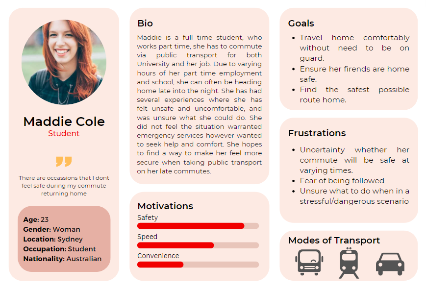
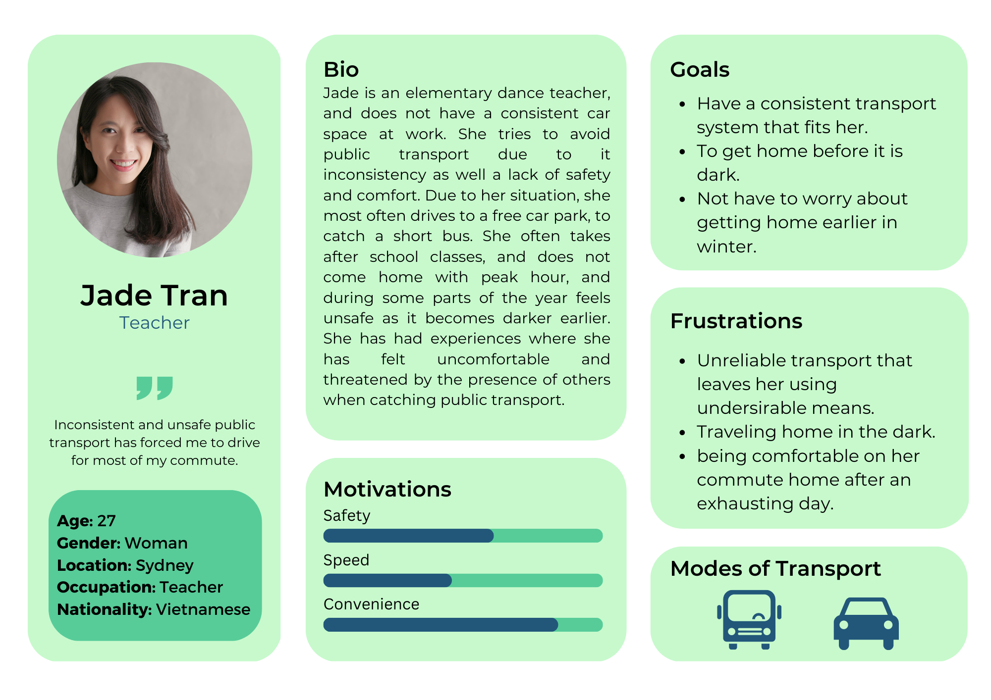
Persona's
Following the interviews, my team and I recognized the need to effectively communicate and understand the data collected. To accomplish this, we developed several Personas. These Personas served as a representation of our target user and allowed us to efficiently analyze and understand the data without the need to review pages of coded interviews.
Throughout the design process, we continually referred back to these Personas to ensure that our solutions were accurately addressing the needs of our users. We also made sure to regularly update and refine the Personas as our understanding of the user evolved.
Ideate
As a design team, we collaborated to identify the three most important features for our solution. Through a thorough prototyping process, we solidified the functionality of these features to ensure they met the needs of our users.
- Our first feature was a Route Selection System that utilized collective user data to determine the safest commuting routes, taking into account the time of travel. This feature aimed to provide peace of mind for commuters, ensuring they have the safest route possible.
- The second feature was an Emergency Contact option. This feature included the ability to contact a safety operator, who could provide emotional support and emergency assistance if necessary.
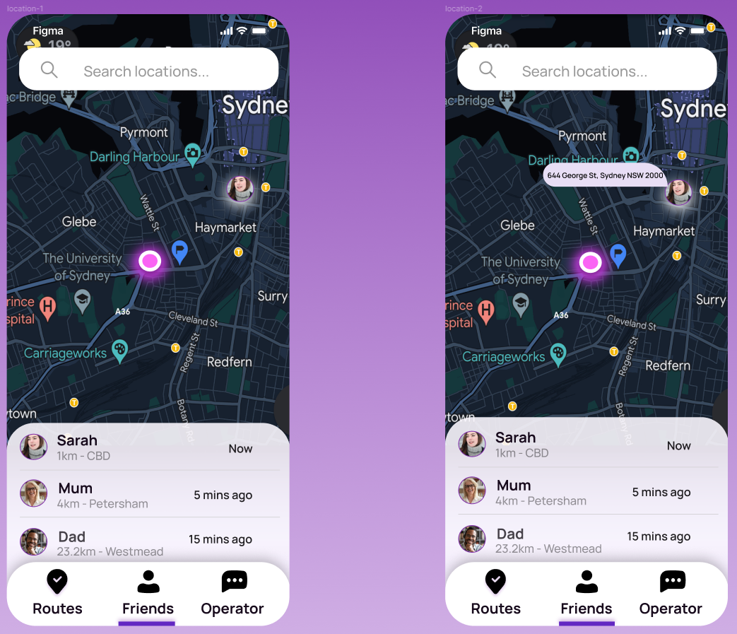
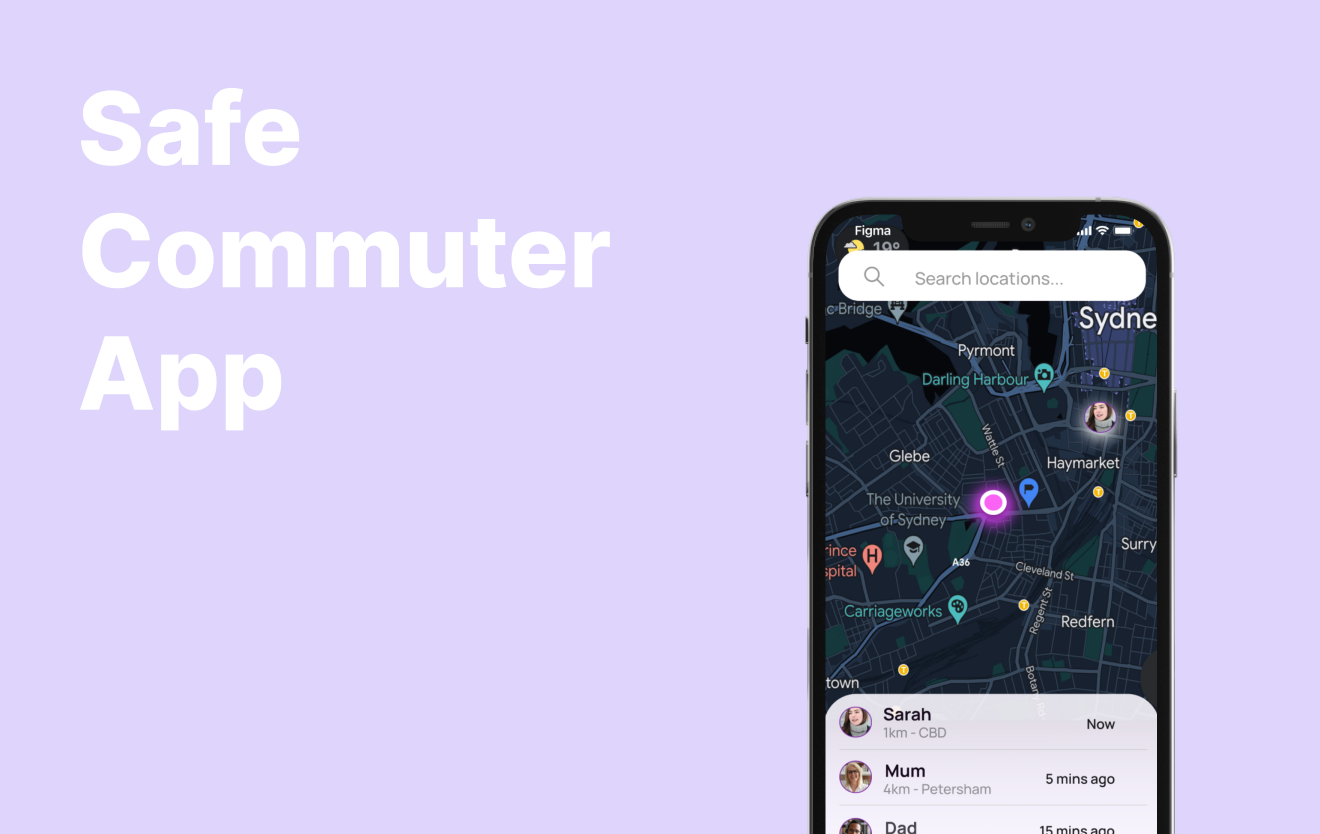
- Lastly, we developed a Social Map that would update with incident reports and allow for trusted contacts to monitor the user's commute, providing an added layer of safety and security.
A Short Survey revealed that these features received the most positive feedback from users, solidifying our team's decision to include them in our design solution.
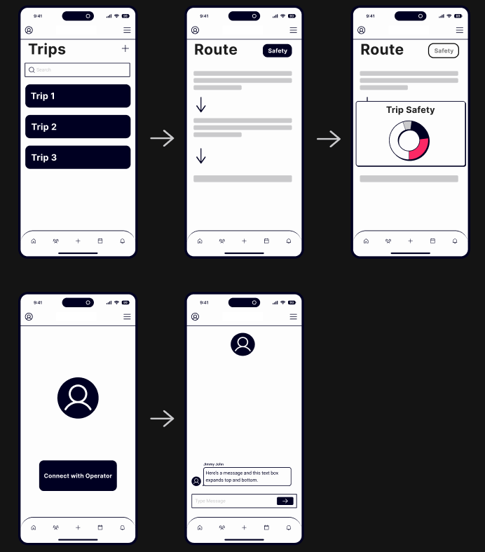
As a member of the design team, I was responsible for creating the initial wireframes for our solution. I began by creating a series of low-fidelity wireframes, which served as a rough outline of the design and allowed us to quickly test and iterate on different ideas. These wireframes were instrumental in helping the team to define the overall structure and layout of the solution, and provided a solid foundation for the development of the final, high-fidelity wireframes.
Using user feedback and testing, I then refined these low-fidelity wireframes to create a set of high-fidelity wireframes that accurately reflected the final design. These wireframes were essential in providing a detailed visual representation of the solution and allowed us to test the design with real users to gather valuable feedback. The hi-fi wireframing process was crucial in ensuring that the final design met the needs and expectations of our users
Prototyping
I worked with the team to prototype three key functionalities for user testing using Figma.
This functional prototype effectively demonstrated the user experience for the Check on Friends feature, which allows users to easily check in on trusted contacts and receive updates on their own status, ensuring a safe and secure journey.
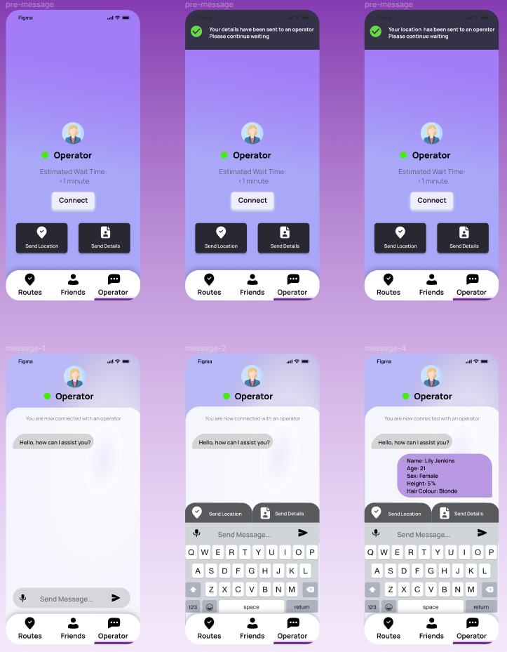
This is how users would be able to Contact Emergency Operator Function.
This includes a way to send your location and personal details to the operator, without needing to type them. To accomodate time sensitive emergencies.
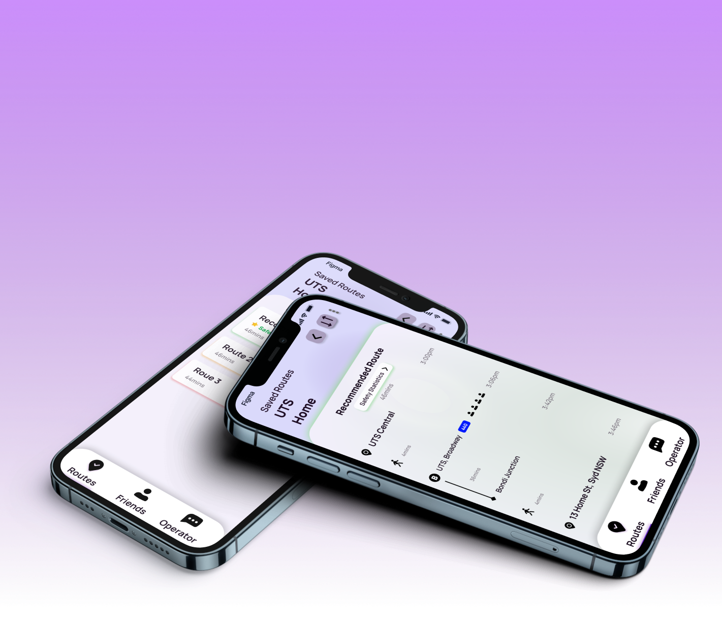
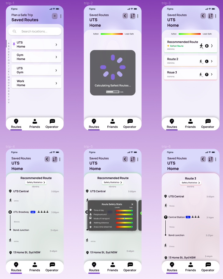
Here shows how the Trip Planning feature would function, which allows users to plan trips based on a safety rating. It additionally allowed users to reverse their trip for returning home.
Selected Works
Safe Commute AppProject type